This page provides an overview on the features of the RepExplore web-application and step-by-step instructions on how to use the software to exploit technical replicate information
in omics data analysis.
1. Introduction and feature overview
Experimental platforms for high-throughput omics measurements are typically affected by technical sources of noise. It is therefore common practice to use
technical replicates in addition to biological replicates in order to account for the noise in the data that was introduced during the measurement process.
For this purpose, metabolomics and proteomics mass spectrometry datasets typically include between two to three
replicates per biological sample and gene and protein microarray chips often contain two or more on-chip replicates
to reduce the influence of technical noise in subsequent data analysis.
While data pre-processing methods using the technical replicates to compute robust
averages for each biological sample
(often referred to as "replicate summarization")
provide benefits in the downstream data analysis in terms of robustness and reliability, the information captured in
the
variance of technical replicate measurements is usually ignored.
RepExplore is a web-application that exploits both information from the averages and the variance of technical replicates in order to obtain more robust
and reliable scores for differential expression/abundance of genes, proteins or metabolites in an omics dataset. Identifying differentially
expressed/abundant biomolecules is one of the most common omics analysis tasks, with specific applications in biomarker discovery for case-control studies
and numerous other applications in the comparison of biological samples under different conditions.
RepExplore facilitates this task for datasets
containing technical and biological replicates, by making recently developed statistics for exploiting technical replicate variance information easily
and quickly accessible for the user. The main features of the software are:
- RepExplore provides a fully automated differential abundance analysis of omics data within few minutes
- The results can be explored interactively using sortable ranking table, interactive heat maps, 3D PCA plots and box-whisker plots
- The web-based software is platform-independent and does not require any prior software installations other than a standard web-browser
- Example datasets can be analyzed directly with a few mouse-clicks to explore the software functionality before uploading new data
2. Quickstart guide
In order to quickly become familiar with RepExplore's features, the user can choose the "Analyze example data" option on the main page, which
will open up a menu, allowing the user to select a test dataset from a public case-control study or wild-type/knockout study
and start an analysis by clicking the "Run Analysis" button.
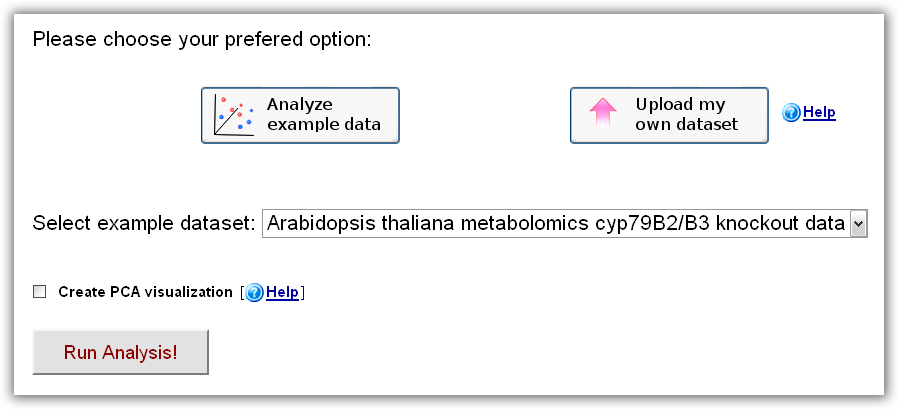
Figure 1: RepExplore main interface after choosing the "Analyze example data" option.
Optionally, a principal component analysis (PCA) visualization can be included
in the output (this may increase the processing time by a few minutes). After
submitting an analyis, a temporary status page is loaded which will redirect the
user to the page with the analysis results after a short waiting time (the time
depends on the dataset size - for larger datasets, the user can bookmark the
status page or request an e-mail notification to return at a later time). On the
results page, the user will find a sortable ranking table of the differentially
abundant biomolecules, a heat map visualization of the top-ranked differential
biomolecules, as well as the possibility to generate bar charts for individual
biomolecules of interest or to download all statistics in tabular format.
In order to analyse the user's own data, the only additional first step
required in comparison to the example data analysis is to upload the
tab-delimited dataset on the main web-interface. The corresponding format
requirements are explained in the following section.
3. Formatting and uploading of omics data
On the RepExplore web-interface the user can upload and analyze any omics
dataset that contains log-scaled intensity measurements with both biological and
technical replicates for two conditions (e.g. "patient vs. healthly control",
"treated vs. untreated", "before knockdown vs after knockdown"). A dataset can
be provided as a tab- text-file, e.g. using the corresponding export-
functionality in common spreadsheet software programs, by specifying one
biomolecule (= gene, protein or metabolite) per line and one sample (= technical
replicate) per column. Please note that biological replicates are required for
all sample groups and technical replicates are required for each biological
sample. The first column contains the biomolecule identifiers, while all
remaining columns contain the numerical expression or abundance levels for the
measured genes, proteins or metabolites in the omics dataset (see Figure 2a).
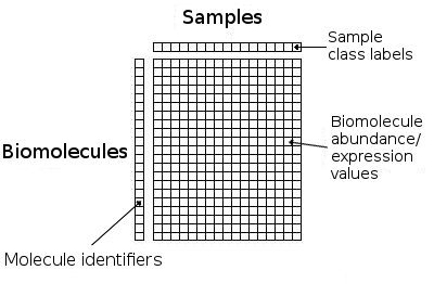
Figure 2a): Schematic format for tab-delimited datasets for analysis on RepExplore.
The biological conditions and technical replicates assignments for the samples
are specified in the first line by providing one numbered label for each
column/sample, consisting of a text label for the biological condition (e.g.
'case' or 'control') concatenated with an underscore and the number for the
biological replicate (e.g. "case_1, case_2, case_3" for 3 different biological
samples for condition 'case') and a further underscore followed by the technical
replicate number (e.g. "case_1_1, case_1_2" for two replicates available for the
first biological sample). Identifiers for samples belonging to the same
biological condition should start with the same text label and may only differ
in the following replicate numbers. For example, Figure 2b) shows a case-control
dataset with 2 biological samples and 2 technical replicates for each biological
sample:
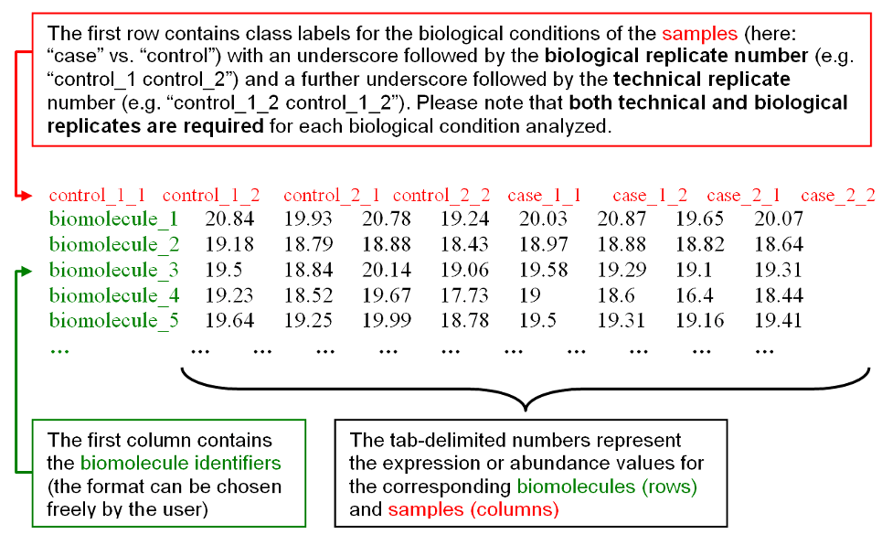
Figure 2b): Example input data with format instructions.
To faciliate the preparation of your input data, you can also download an
example dataset in the required format
here as a reference. After choosing the "Upload my
own omics dataset" option on the main web-interface and clicking the "Click here
to upload dataset" button, a dataset on your local hard drive can be selected
and sent to the RepExplore web-server. When the successful upload is confirmed
(i.e. "File upload successful" appears on the main interface), the analysis can
be started by clicking the "Run Analysis" button (optionally, a median-scaling
or variance-stabilizing normalization can be applied to the data prior to the
analysis). Please
contact us, should
you have any questions regarding the formatting, upload or analysis of your data.
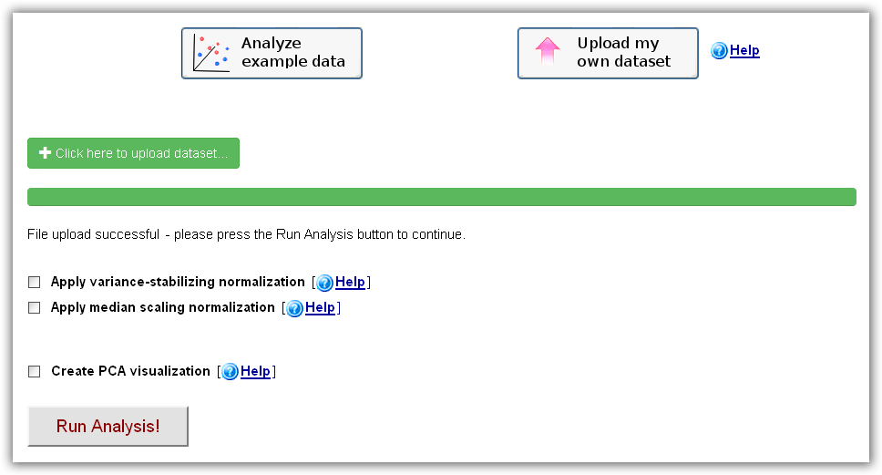
Figure 2c): RepExplore main interface after choosing the "Upload my own dataset" option.
4. Differential expression/abundance analysis of biomolecules
When the RepExplore web-application has successfully processed an uploaded omics dataset, the user will be redirected to a results page, containing an interactive ranking table of the differentially abundant biomolecules (see Figure 4 below, up to 500 top-ranked biomolecules are included in the interactive table), a downloadable version of the complete ranking table covering all biomolcules in the dataset, and an interactive heat map visualization of the top 15 differentially abundant biomolecules. The ranking table is sortable and by clicking multiple times on a chosen column header, each column can be sorted either in descending or ascending order.
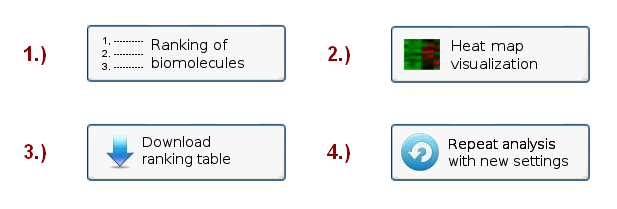
Figure 3: Menu on the RepExplore Results page, showing the available options.
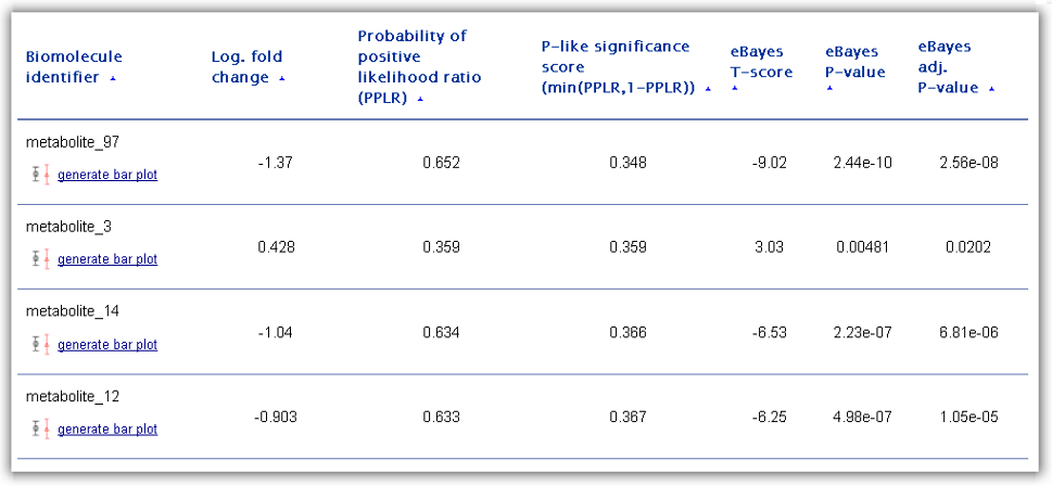
Figure 4: Ranking table of differentially abundant biomolecules generated as one of the main RepExplore outputs.
The first column of the ranking table contains the biomolecule identifiers as
provided in the first column of the uploaded omics dataset. For each ranked
biomolecule, the user has the possibility to generate a bar chart visualization
by clicking on the corresponding link "generate bar plot" below the identifier
(see example in Figure 5 below). This chart displays both the average abundance
levels of the biomolecules in the different biological conditions (highlighted
by different colors) and the standard deviation of the technical replicates
around these average abundance levels (the average abundance levels are
represented by the short horizontal lines and the standard deviations by the
length of the vertical lines crossing the horizontal lines, see Figure 5).
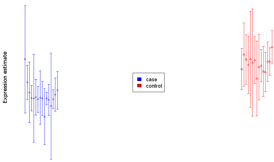
Figure 5: Bar chart visualization for a single differentially abundant biomolecule.
The ranking score for differential expression/abundance used to order the
biomolecules is determined by the "probability of positive log-ratio (PPLR)"
statistic between two specified biological conditions. This statistic (provided
in table column 3) differs from conventional differential expression statistics
in that it takes into account the variance among technical replicate samples in
the input data (see Liu et al., Bioinformatics, 2006; Pearson et al., BMC
Bioinformatics, 2009). The PPLR statistic represents the likelihood of the ratio
between case and control condition measurements being positive (i.e. the case
samples being up-regulated in respect to the control samples). While a PPLR
close to 1 signals an up-regulation in the cases as compared to controls, a PPLR
close to 0 indicates a down-regulation. Although PPLR values do not correspond
to classical p-value statistics, a transformation into a "p-like" significance
score (= min(PPLR, 1-PPLR)) is possible (see 4th column in the ranking table).
For comparison, columns 5 to 6 in the ranking table show results for a commonly
used empirical Bayes moderated T-test applied to the mean-summarized technical
replicates (including the T-score, the p-value significance score, and the
adjusted p-value according to the Benjamini-Hochberg method). When selecting
differentially abundant genes/proteins/metabolites users should not only take
these significance scores into account, but also the effect size, measured by
the mean fold change (i.e. the ratio between mean abundance level in cases to
controls transformed to logarithmic scale, here provided in the 2nd table
column).
As a final output, RepExplore generates an interactive heat map
visualization of the top 15 most differentially abundant biomolecules across the
samples of the input dataset using a color coding (see example in Figure 6; red
= higher relative abundance levels, blue = lower relative abundance levels).
Both the samples (corresponding to the columns in the heat map) and the
biomolecules (corresponding to the rows) are clustered using average linkage
hierarchical clustering, and the Z-score intensity for each sample/biomolecule
combination can be viewed by clicking on the corresponding entry in the heat
map. Overall, heat map provides an indication of how well the different
biological conditions in the input data can be discriminated from each other
using the top differentially abundant biomolecules.
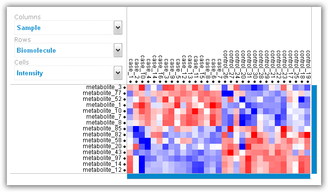
Figure 6: Heat map visualization of top differentially abundant biomolecules.
5. 2D and 3D principal component analysis of samples
In order to obtain a human-interpretable visual representation of an uploaded dataset,
which can reveal local grouping patterns among the samples or facilitate the
recognition of outlier samples, the user can optionally generate 2D and 3D
principal component analysis (PCA) plots. A corresponding check box above the
submission button on the main web-interface has to be marked for this purpose
before running the analysis (including the PCA may increase the runtime of a
job by a few minutes, depending on the dataset size). The specific PCA
methodology employed in RepExplore makes use of variance information in
technical replicates in order to obtain more robust results with regard to noise
in the original data (since the classical PCA applied to mean or median
measurements assumes a similar extent of noise for all measurements, which does
not apply to typical omics datasets, using the modified PCA version to exploit
replicate variance information increases the robustness and reliability of the
outcome).
In the 2D PCA plot shown on the results page after job completion
the axes correspond to the first two principal components of the input data
(i.e. they point into the first two independent directions of maximum variance
in the original variable space). In addition
to the static 2D plot the user can also view an interactive 3D PCA visualization
(see Fig. 7) of the first three principal components by using a VRML 2.0 browser
plugin or downloading the generated VRML-file for offline display in a VRML-
viewer (e.g. using the free versions of the
bsContact
Viewer, the
Instant
Player,
XJ3D
Browser or the
Cortona viewer). The VRML-visualization enables the user to
rotate the plot, zoom into it and click on the samples in order to see the
corresponding sample numbers and class labels for the biological conditions
appear above the vertical axis.
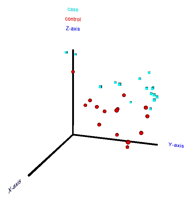
Figure 7: 3D interactive principal component analysis plot for a metabolomics dataset from a case-control study (perspective from a VRML browser).
6. Troubleshooting (system requirements & browser compatibility)
RepExplore is compatible with any recent version of a Javascript-enabled web-browser on common 32-bit
operating systems (Windows, Linux and MacOS). The webpage is optimized for a screen resolution of 1680x1050, but has been tested successfully on various other systems with higher resolution. No browser plug-ins are required to display the visualizations, but the generation of some of the plots may require a short waiting time.
Should you experience any problems when displaying the web page or downloading results, please
contact us.